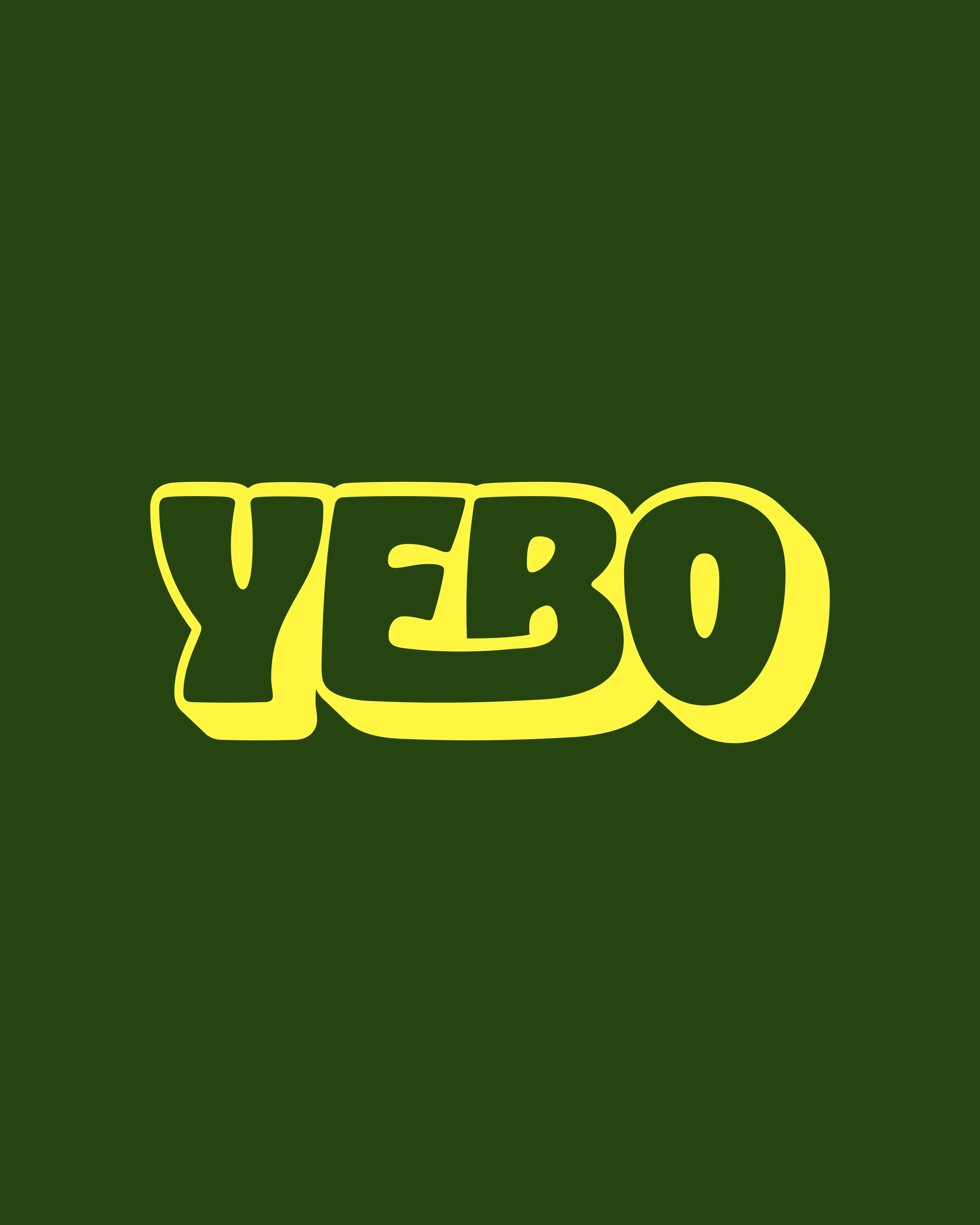
Yebo
There are many variations of passages of Lorem Ipsum available, but the majority have suffered alteration in some form, by injected humour, or randomised words which don't look even slightly believable.
Year
2025
Industry
Events Management
Services
Brand Identity
Client
Yebo

Yebo is an event brand based in France, created to bring people together through high-energy, immersive live experiences.
Rooted in music, movement, and shared atmosphere, the brand needed to feel instantly recognisable and emotionally driven. Our role was to develop a visual identity that could capture the feeling of being present at a Yebo event, while remaining flexible enough to live across digital platforms, physical spaces, and large-scale advertising.
The objective was to create a brand that felt bold, confident, and memorable, without losing clarity or usability
The main challenge with Yebo was translating the energy of a live event into a cohesive visual system.
The brand needed to work across a wide range of applications, from app icons and social media to billboards, posters, and venue signage, while maintaining a strong sense of identity. It was essential that the branding felt dynamic and expressive, yet simple enough to scale and adapt quickly across different formats. The identity also needed to stand out in crowded environments, where attention is limited and visual impact is critical.
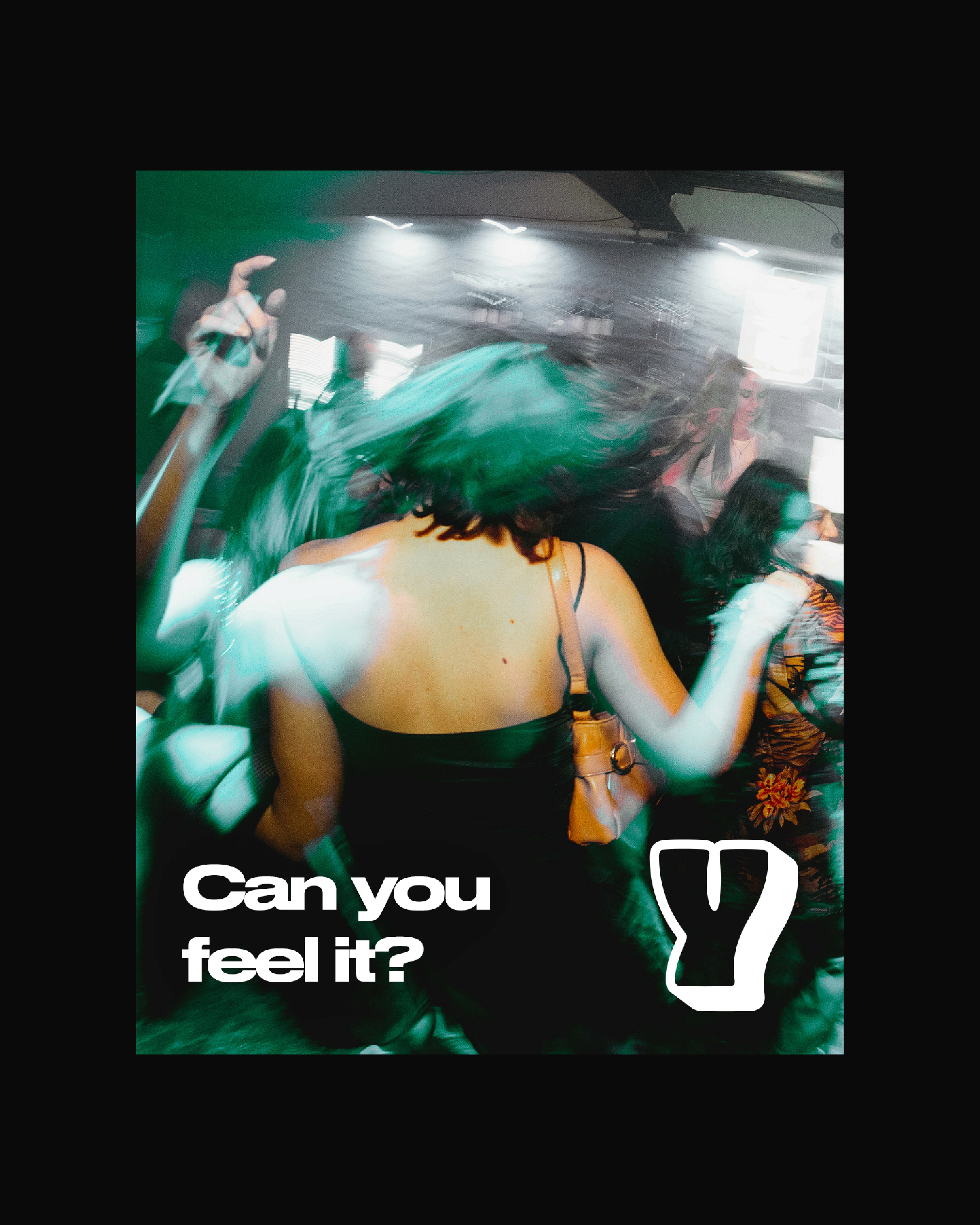
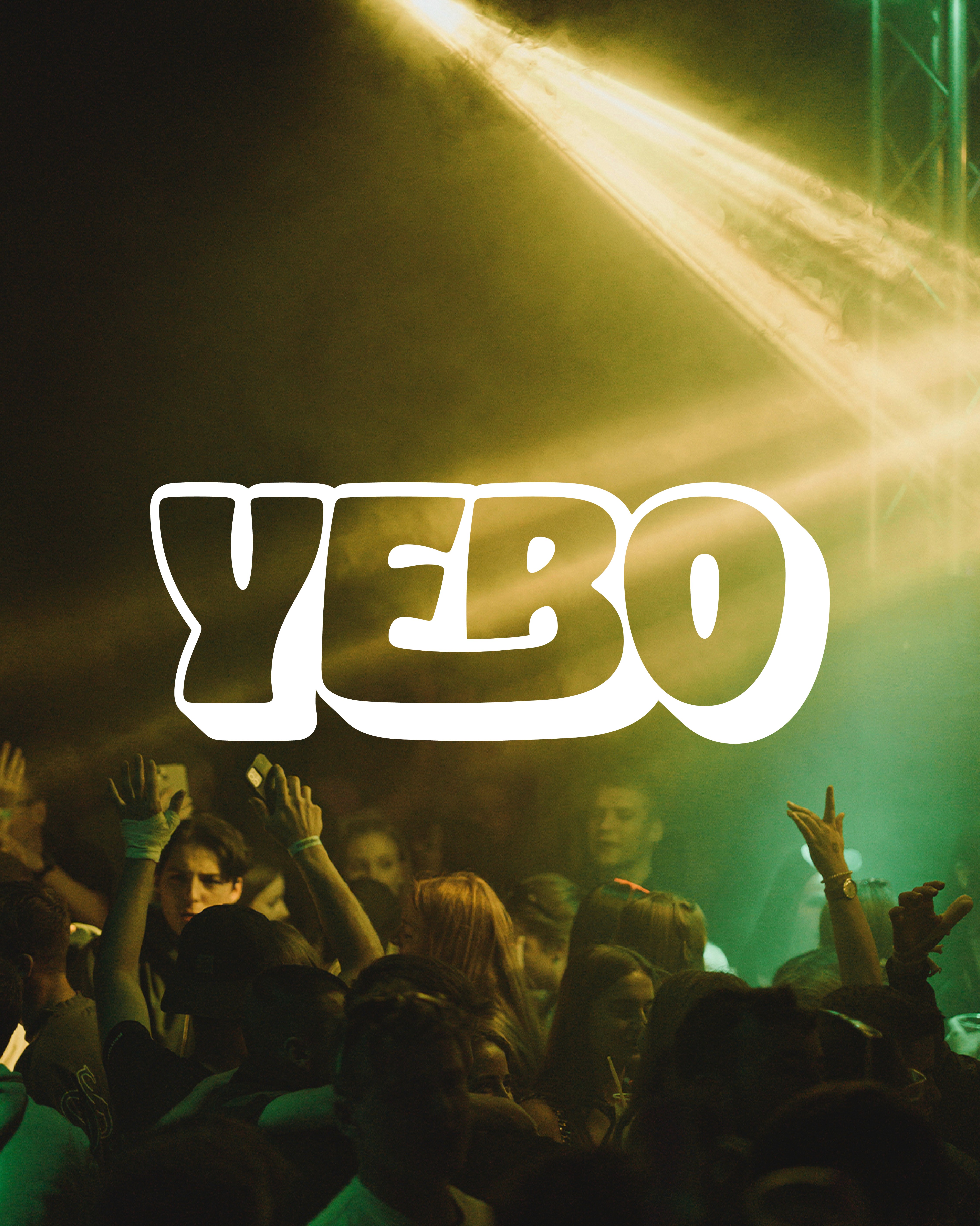
The creative direction for Yebo focused on movement, emotion, and presence. We designed the brand to feel instinctive and physical, echoing the atmosphere of being inside a live crowd. A deep green base colour was introduced to ground the brand and create a sense of depth, while the bold yellow accent was used to cut through environments with high contrast and immediate visibility.
Photography and motion-led visuals were paired with minimal typography to reinforce the feeling of energy and immersion, allowing the brand to communicate mood without relying on excessive messaging.
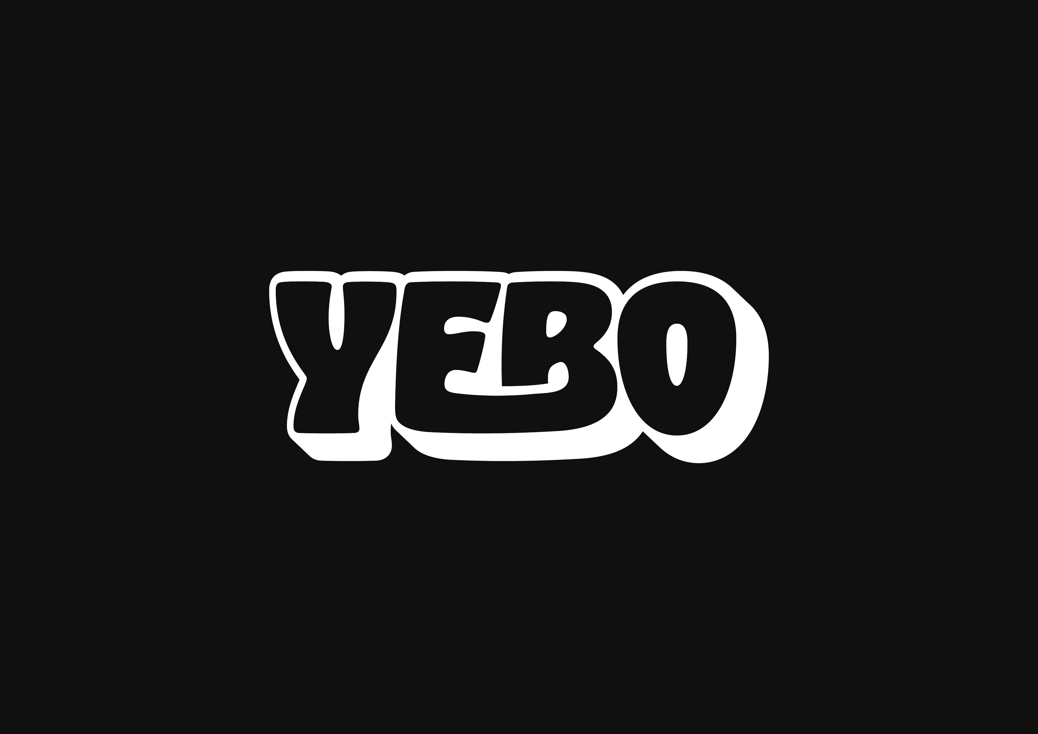
The Yebo logo was designed as a bold, expressive wordmark with organic letterforms that feel human and dynamic rather than rigid or corporate.
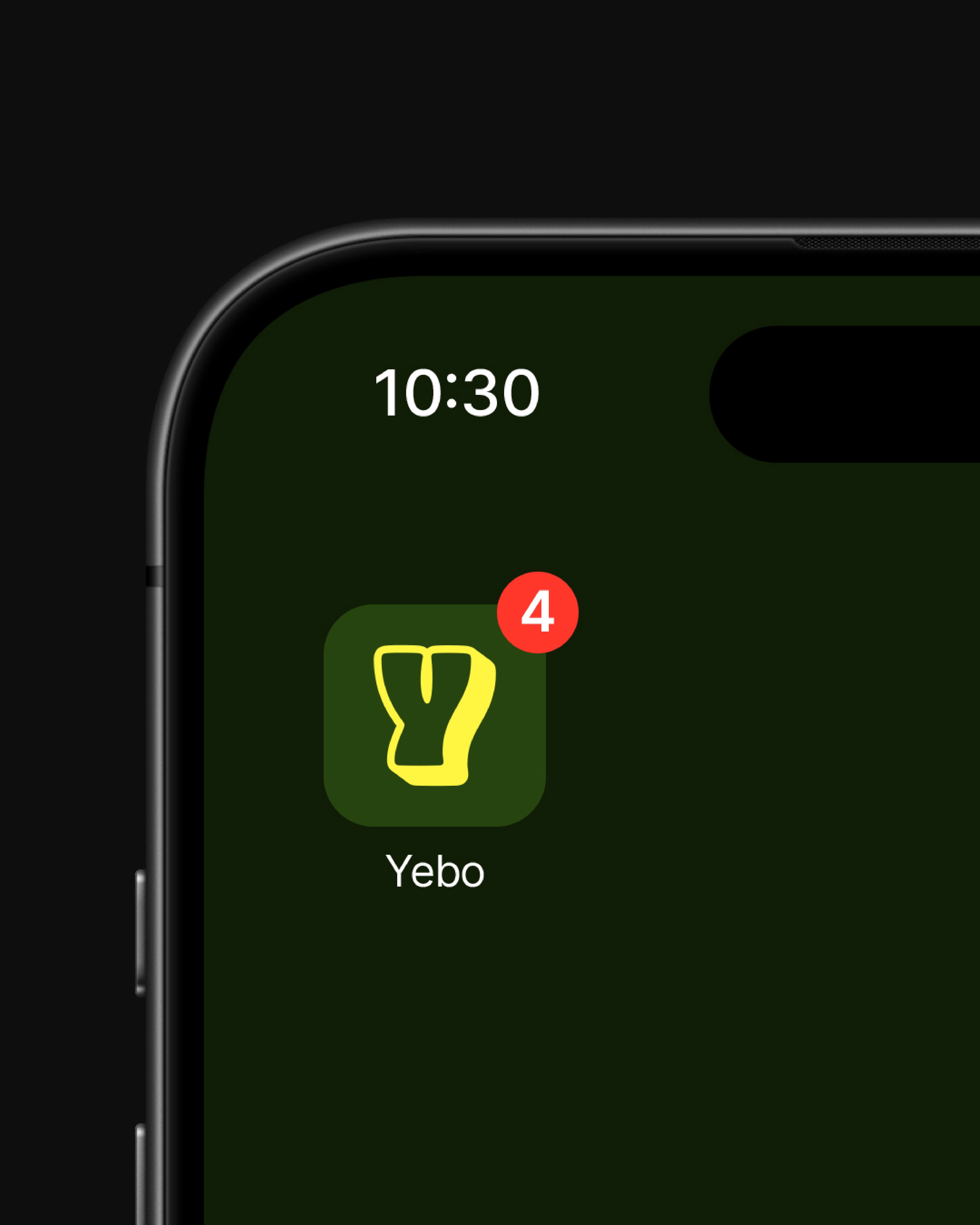
The shapes are intentionally softened and slightly irregular, reflecting movement and sound rather than precision. Alongside the primary logo, a simpli ed submark was created for use as an app icon, notification badge, and social avatar.
This submark ensures the brand remains recognisable even at small sizes or in constrained digital spaces. The logo system was designed to be highly exible, allowing it to sit comfortably over photography, gradients, and solid colour applications without losing clarity or impact.
The Yebo brand was rolled out across a wide range of touchpoints, including billboard advertising, poster campaigns, digital assets, and mobile app visuals
The strong contrast between colour, typography, and imagery ensures the brand stands out in both physical and digital environments. The system allows Yebo to communicate energy and atmosphere instantly, while remaining consistent and scalable as the brand grows. The nal outcome is a confident and distinctive identity that captures the essence of live events, positioning Yebo as a bold presence within the European events scene.