Textured Touch
Textured Touch is a hair and beauty brand created specifically to serve textured hair, with a focus on care, quality, and cultural understanding.
Year
2025
Industry
Hair & Beauty
Services
Brand Identity
Client
Textured Touch
Textured Touch is a hair and beauty brand created specifically to serve textured hair, with a focus on care, quality, and cultural understanding.
The project centred on building a brand identity that could clearly communicate these values while standing apart in an increasingly saturated beauty market.
Prior to working together, the brand relied on a basic logo created in Canva. While functional at a surface level, it lacked flexibility, scalability, and consistency. The logo could not be adapted across packaging, digital platforms, or physical applications, limiting the brand’s ability to grow and present itself professionally.
Our role was to create a considered brand system, not just a logo that could support long-term growth. This included a primary logo, a refined submark, and a cohesive visual language that could be applied confidently across packaging, marketing, and physical spaces.
The main challenge was building distinction while maintaining authenticity.
Textured Touch needed to stand out from competitors without relying on trends or visual clichés commonly found within the hair and beauty industry.
Their previous Canva logo created several limitations. It lacked the versatility required to work across different formats and scales, offered no recognisable visual signature, and provided no system that could be extended into packaging or supporting brand assets.
Alongside this, there was a broader strategic challenge. The brand needed to feel premium and intentional, while remaining approachable and culturally relevant to its audience. This required careful consideration of form, colour, and symbolism, ensuring every design decision served a purpose beyond aesthetics.
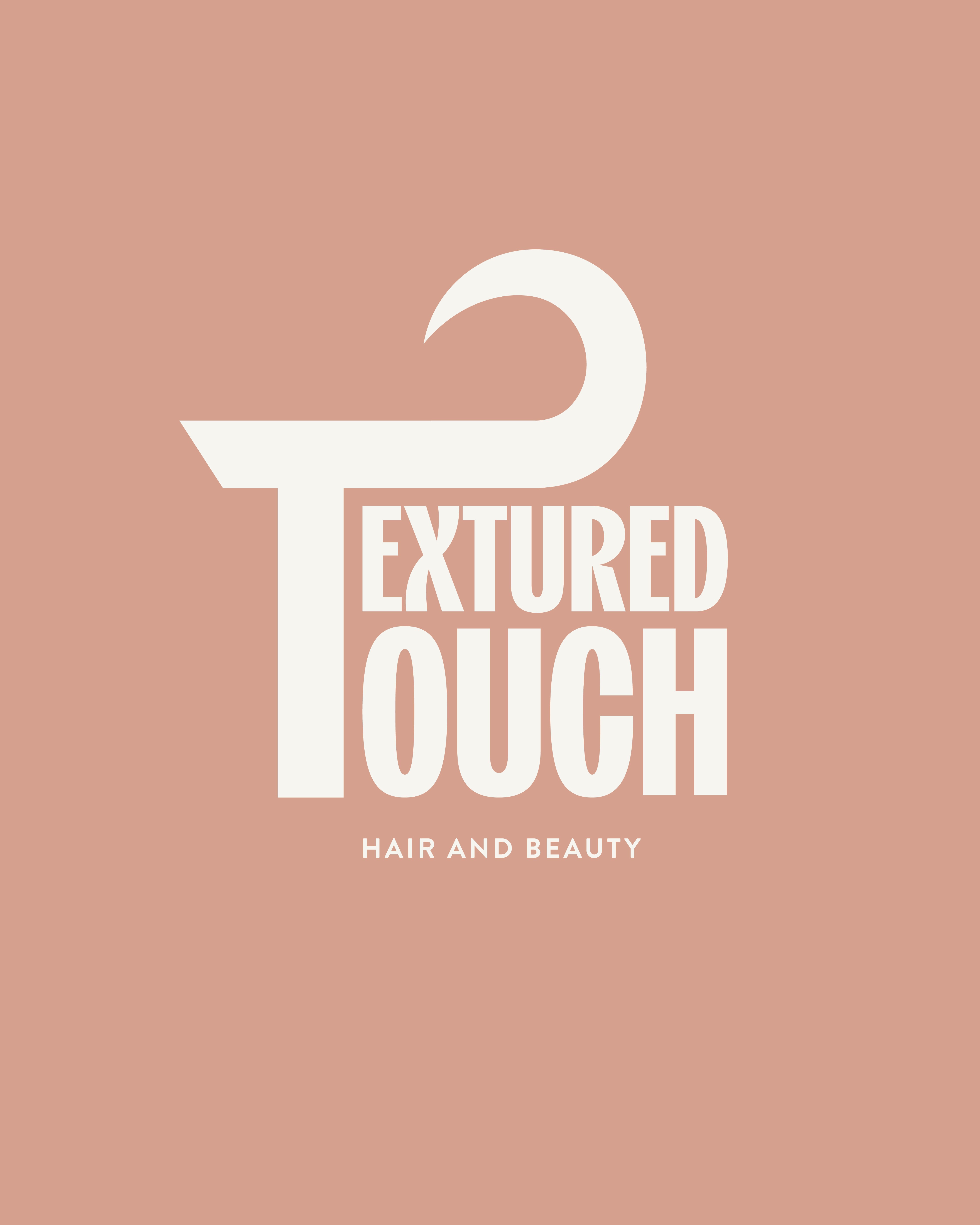
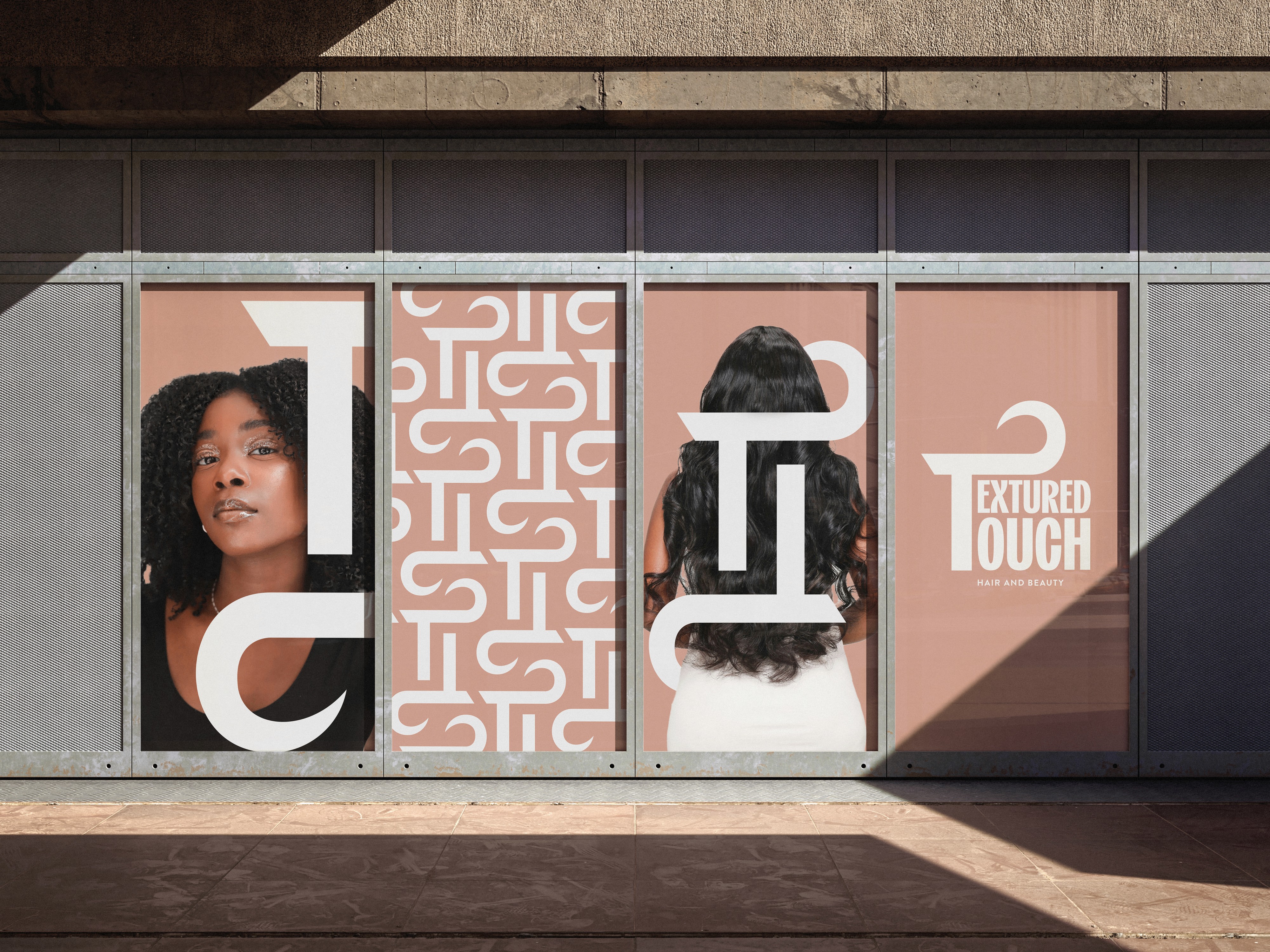
The primary logo was custom-designed to create a distinctive and ownable identity.
A subtle curl was integrated into the letter ‘T’, referencing hair texture in a refined and understated way. This detail became a key visual marker meaningful to the brand’s audience without being overt or literal.
A warm beige colour palette was selected to communicate softness, care, and luxury, setting Textured Touch apart from competitors that rely on harsher contrasts or overly clinical tones. The palette works across both digital and physical environments, maintaining consistency wherever the brand appears.
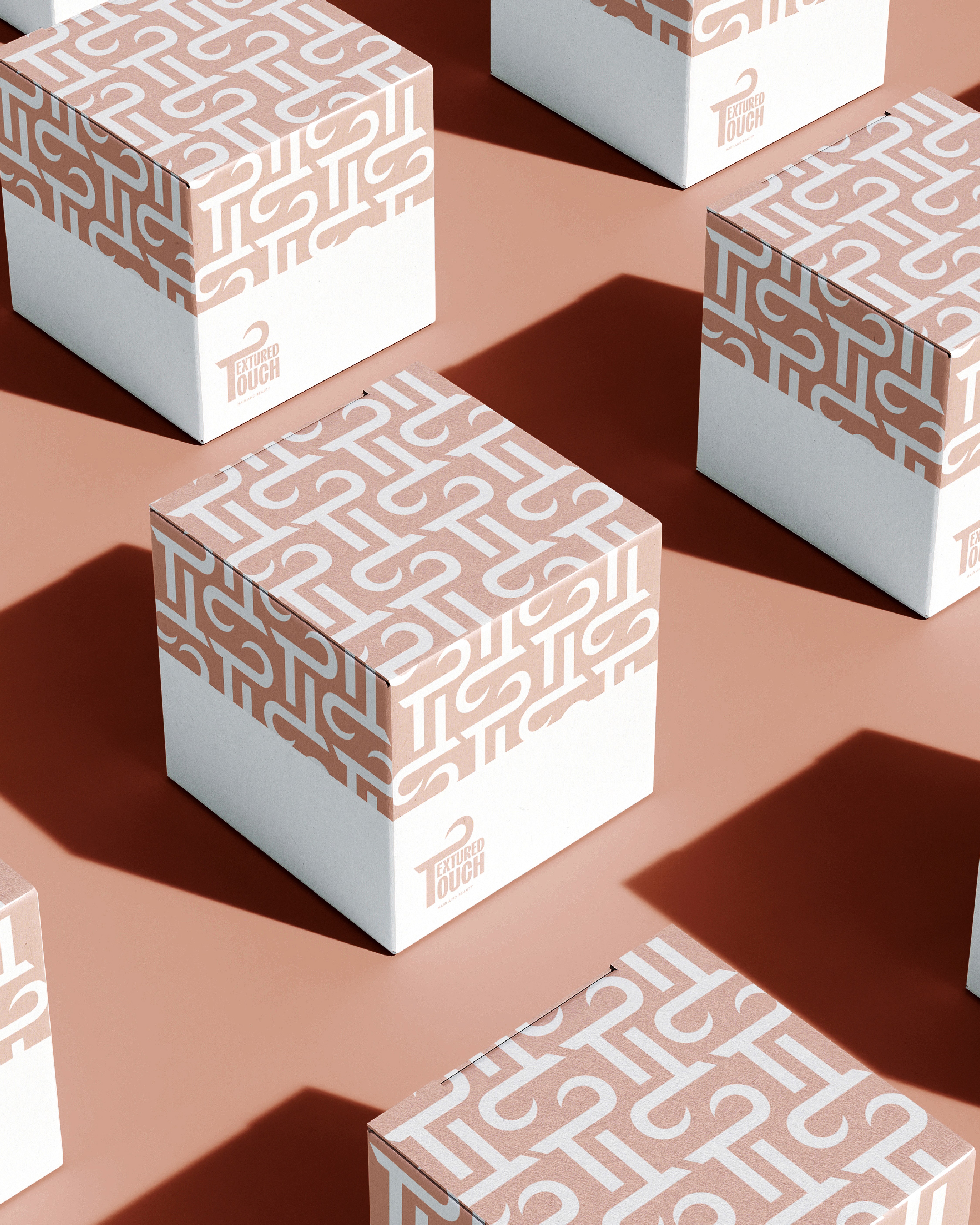
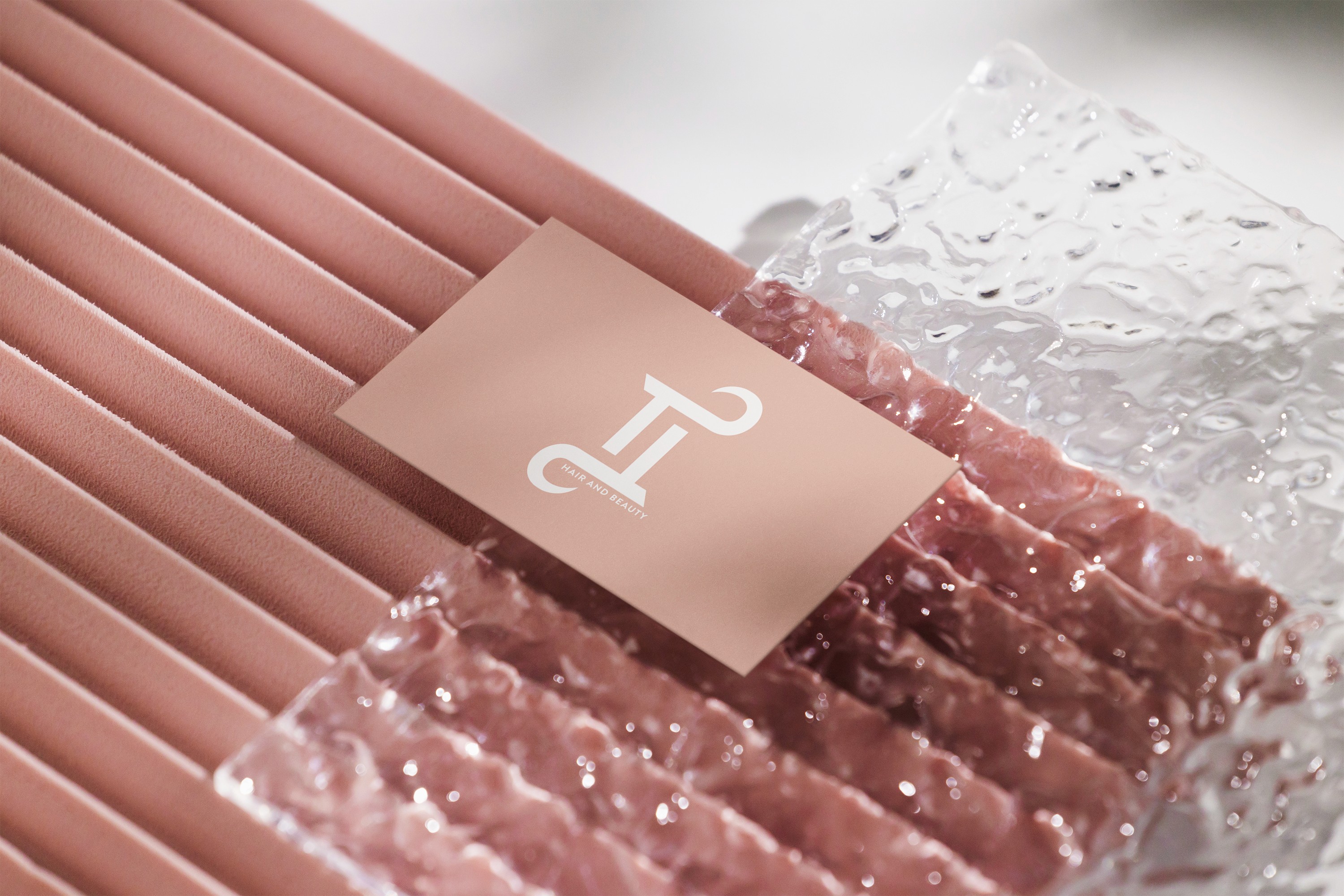
To support scalability, a TT submark was developed and used as a repeat pattern across packaging. This allowed the brand to maintain strong recognition while introducing visual interest and structure, particularly across product boxes and containers.
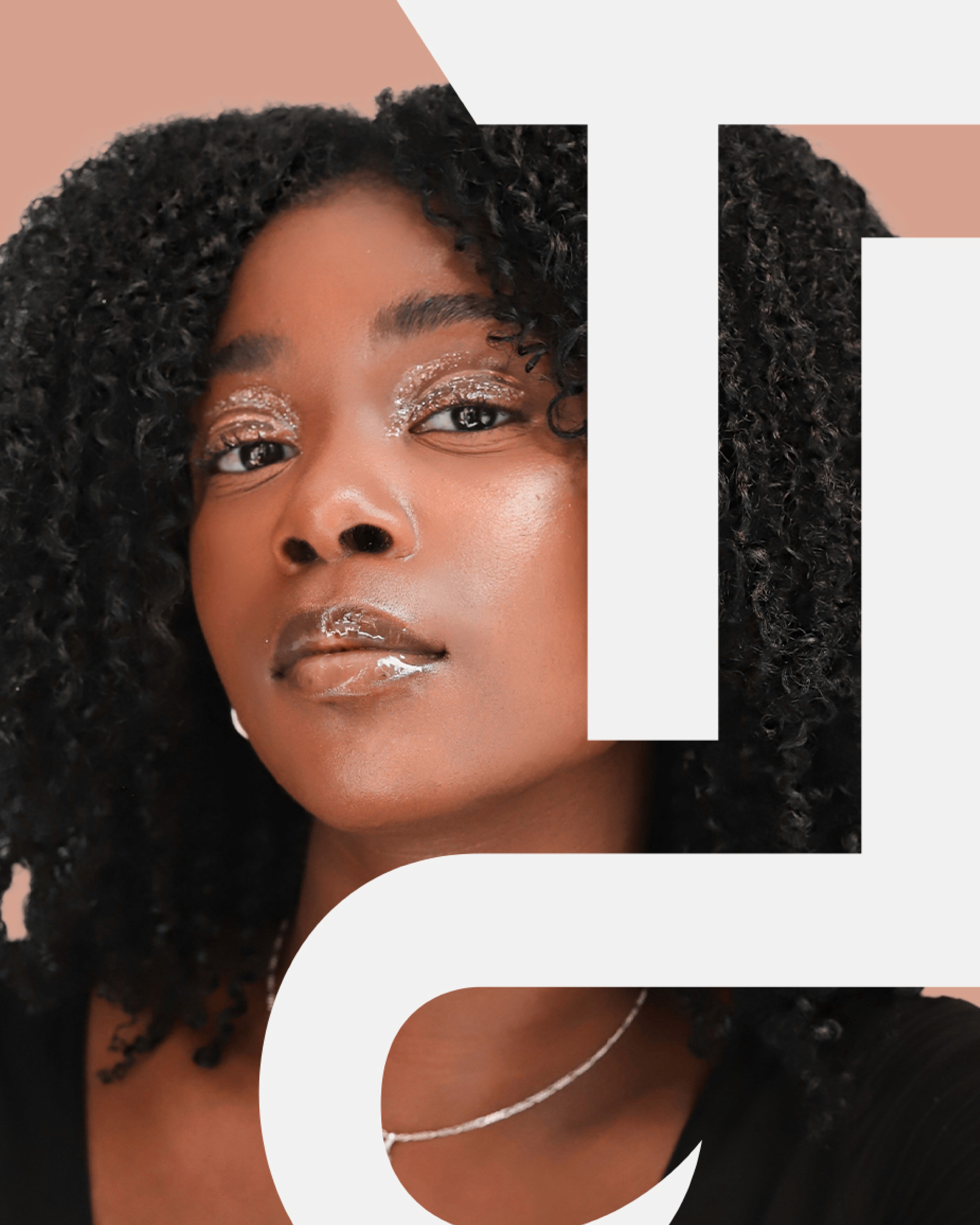
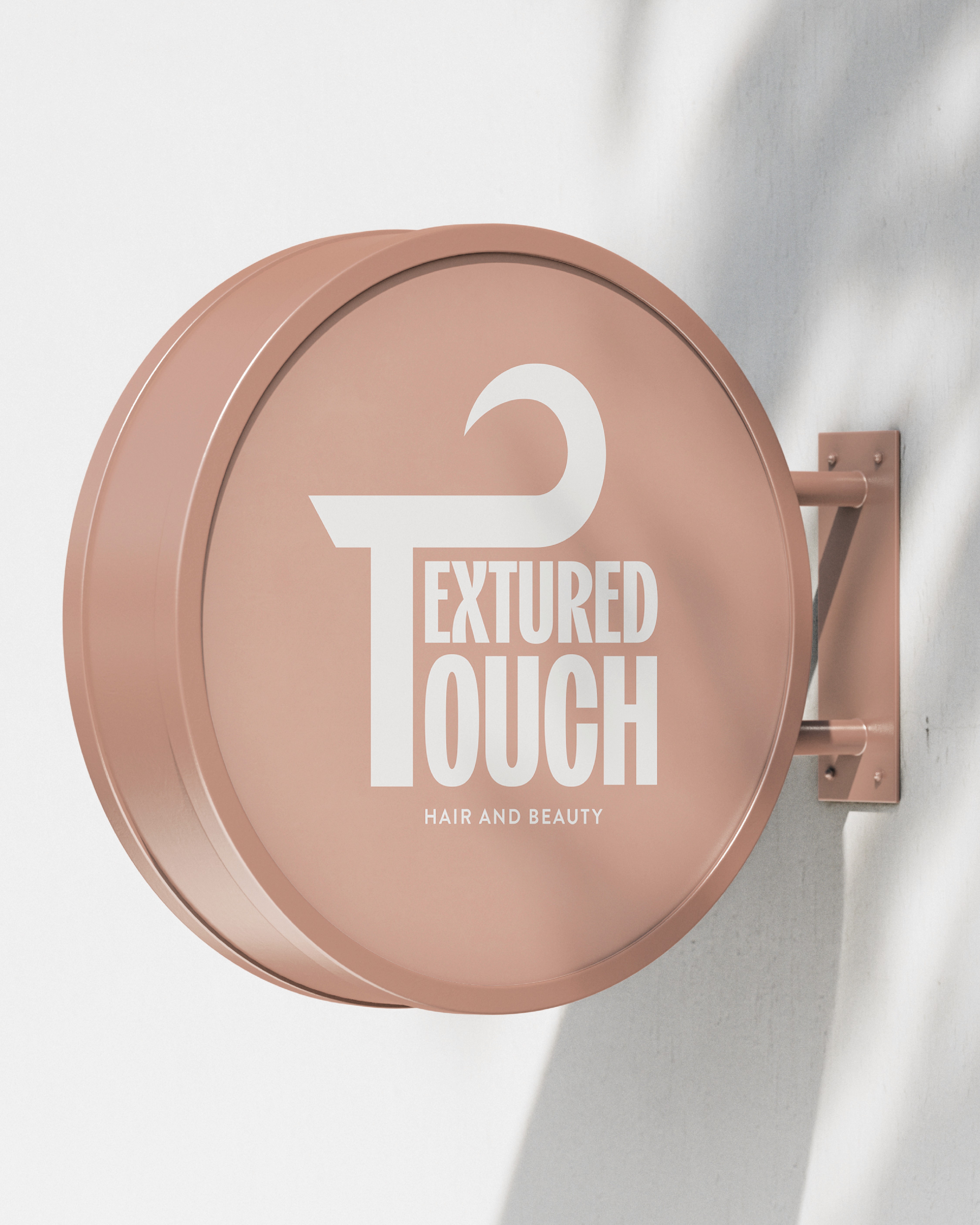
The identity system was designed to be flexible, allowing it to perform across packaging, signage, photography, and environmental applications, as seen across the mockups.
The outcome was a complete shift in how Textured Touch presents itself.
What began as a limited, inflexible identity evolved into a cohesive brand system built for growth, recognition, and longevity.
The new branding provides Textured Touch with the tools to compete con dently within the hair and beauty market, clearly communicate its purpose, and scale across multiple touchpoints. More than a visual refresh, the project established a strong foundation for the brand’s future one that re ects both the quality of the products and the audience it serves.