Drovi
Drovi is an AI-powered networking and event management app designed to help professionals build meaningful connections with ease.
Year
2025
Industry
Tech
Services
Brand Identity
Client
Drovi
Drovi is an AI-powered networking and event management app designed to help professionals build meaningful connections with ease.
Built for modern events and fast-paced environments, Drovi bridges the gap between in-person interactions and digital follow-up through smart technology and intuitive design.
We partnered with Drovi to create a complete brand identity from the ground up, supporting the platform’s launch across digital, physical, and experiential touchpoints.
As a new tech product entering a competitive space, Drovi needed a brand that felt innovative, credible, and instantly recognisable.
The challenge was to communicate the platform’s value, smarter networking and seamless connection without overcomplicating the visual language.
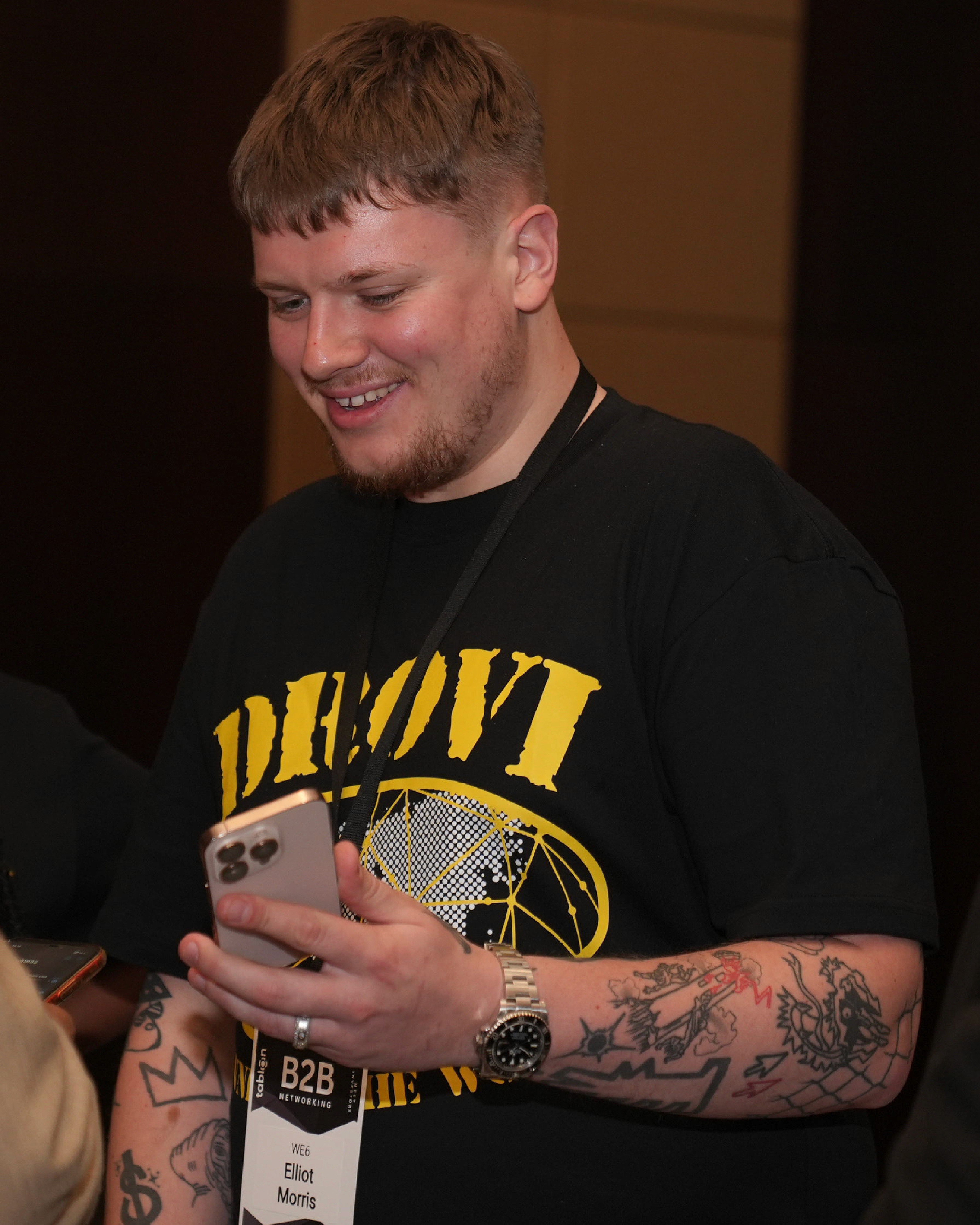
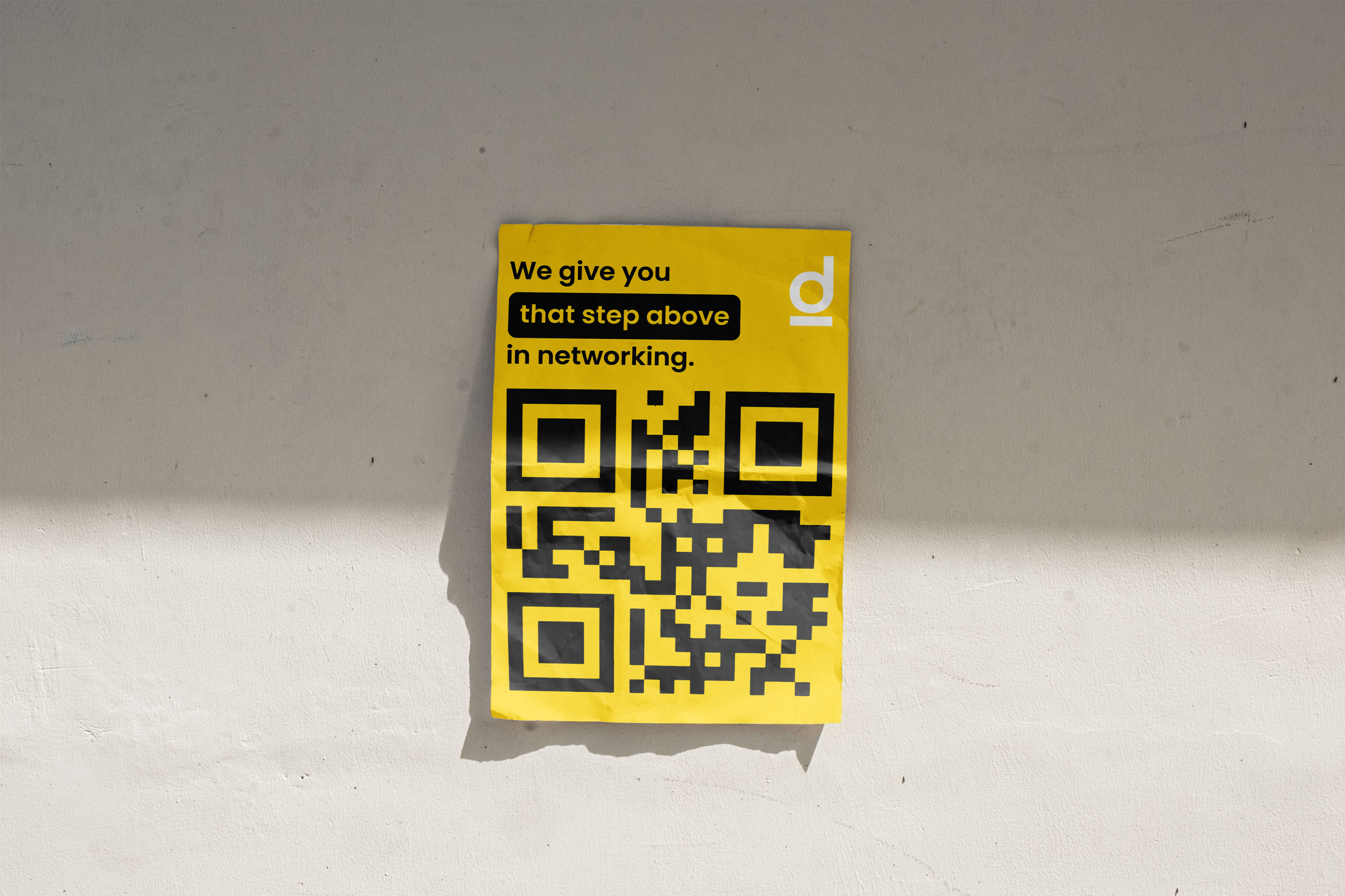
The brand also needed to scale across multiple environments, from an app icon and digital interfaces to physical merchandise, printed materials, and live event assets. Consistency, clarity, and memorability were critical from day one.
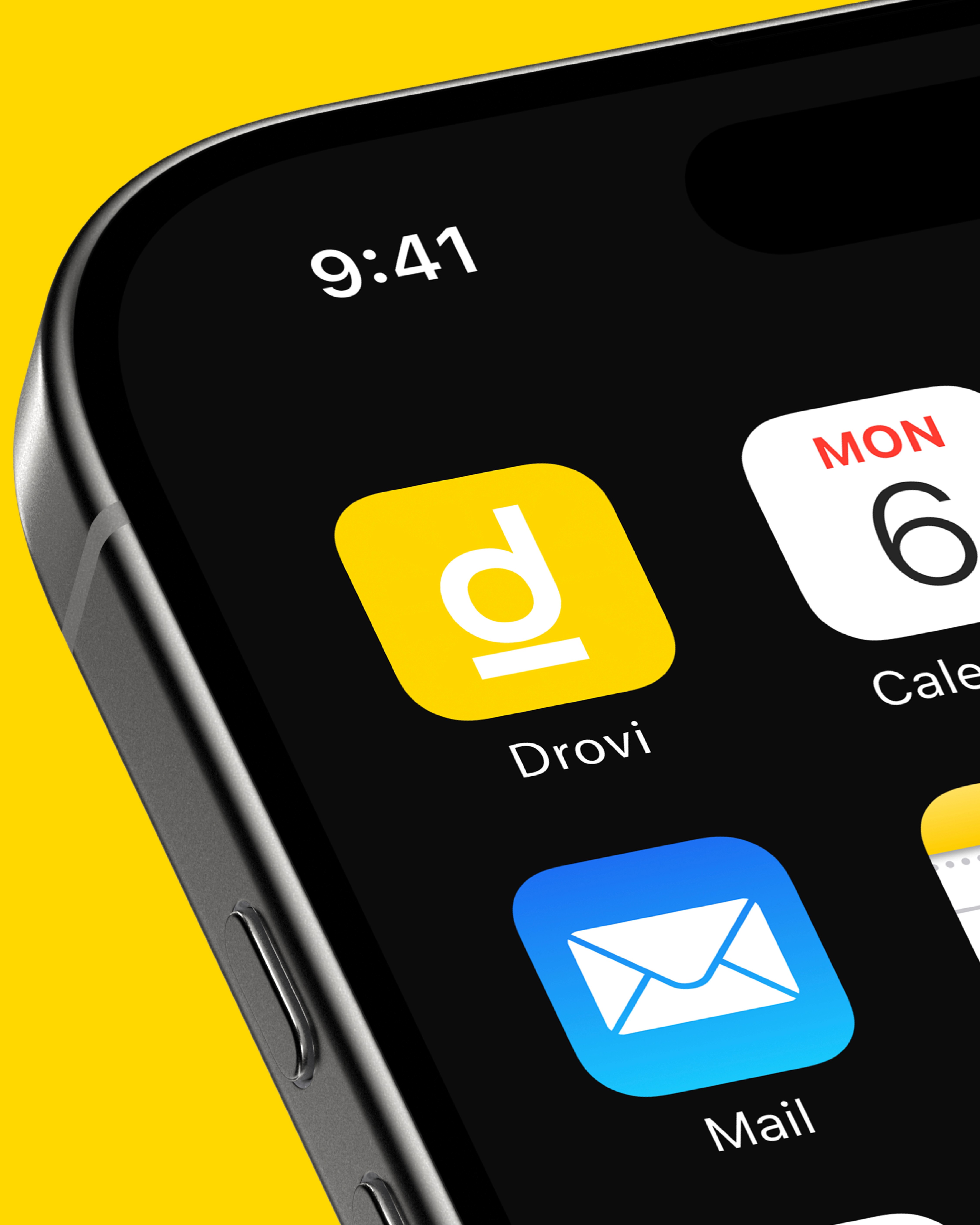
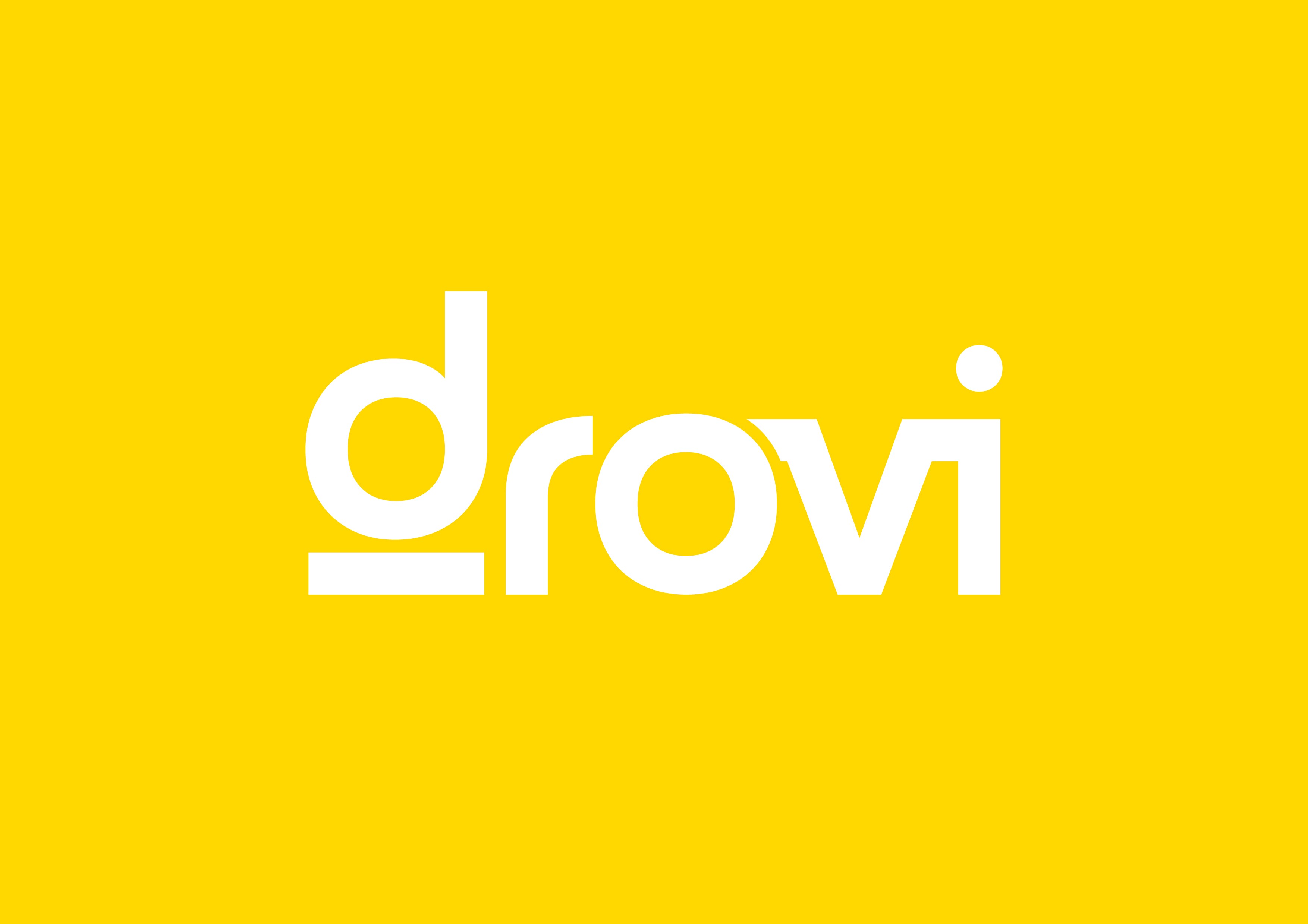
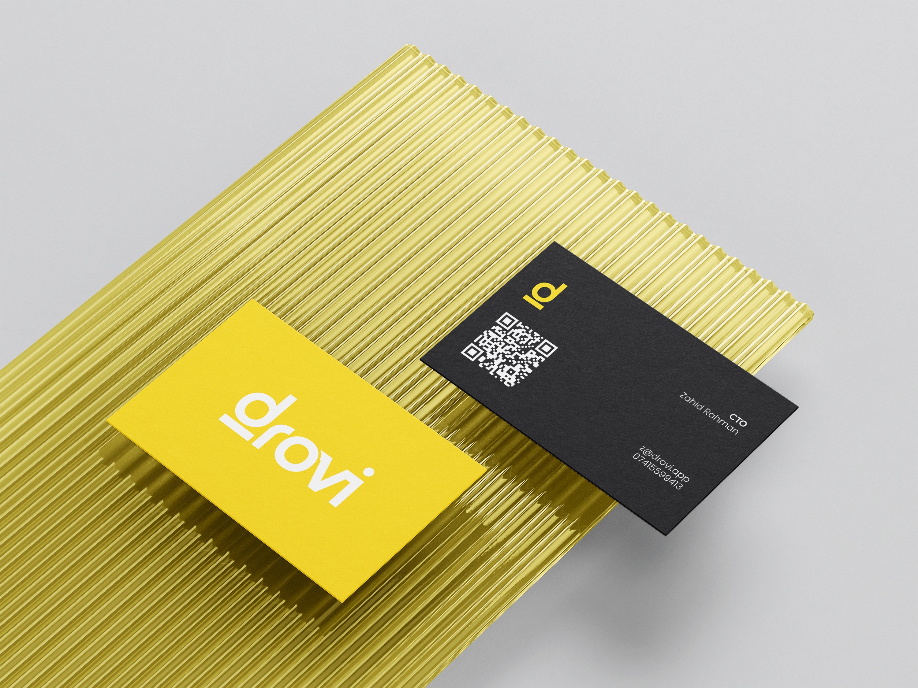
The primary logo was designed to be strong and legible across all scales, while the submark provided flexibility for smaller applications.
The submark became a central asset within the brand system, most notably as the app icon, ensuring immediate recognition on mobile devices.
Together, the logo suite created a cohesive system that could be extended e ortlessly across marketing materials, merchandise, and product interfaces without losing clarity or impact.
Our approach focused on building a bold yet minimal brand system that could flex across platforms while maintaining a strong core identity.
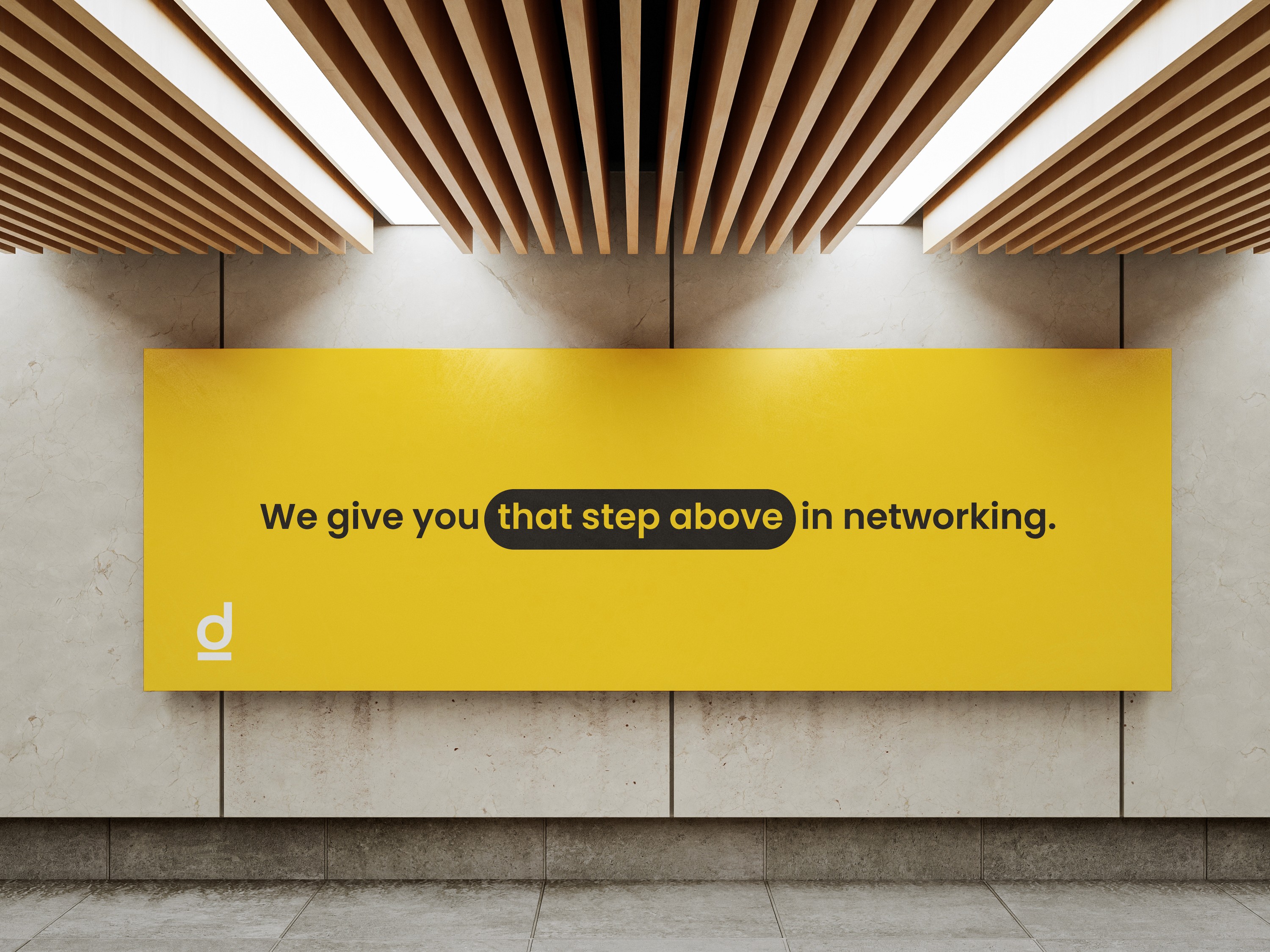
We designed a primary logo and submark that felt modern, confident, and future-facing. A key detail within the logo is the subtle line beneath the letter “d”, which visually represents Drovi’s slogan — “that step above.” This grounding element reinforces the brand’s promise of elevating the networking experience.
The typography and colour palette were chosen to feel clean and contemporary, ensuring high contrast, accessibility, and strong visibility in both digital and physical settings.
The final result was a cohesive, scalable brand system that supported Drovi’s launch across every key touchpoint.
From app icon to merchandise, from printed materials to live events, the brand delivered clarity, confidence, and consistency.
Drovi launched successfully on the App Store with a strong visual identity that aligned with its mission helping people connect smarter, faster, and more meaningfully