Cluckin’ Hot
Cluckin’ Hot is a fast-growing food brand built around bold flavours, high heat, and an unapologetic personality.
Year
2024
Industry
Hospitality
Services
Brand Identity
Client
Cluckin’ Hot
Cluckin’ Hot is a fast-growing food brand built around bold flavours, high heat, and an unapologetic personality.
The project involved creating the brand from the ground up, from naming and visual identity through to menus, posters, signage, and a full social media launch campaign.
The goal was to create a brand that felt instantly recognisable, energetic, and memorable in a highly competitive food market, while remaining flexible enough to scale across physical and digital environments.
Everything was designed to work hard in real-world conditions on the street, in-store, on packaging, and across social platforms

The primary challenge was differentiation.
Fried chicken and burger brands are everywhere, and many rely on similar visual tropes that quickly blend together. Cluckin’ Hot needed a brand that stood out immediately, communicated heat and flavour at a glance, and felt confident rather than generic.
The identity also had to perform across multiple touchpoints from day one — menus needed to be clear and fast to read, posters had to grab attention in busy urban environments, and social content needed to stop the scroll while remaining consistent and on-brand.
This required a system that was bold without being chaotic, playful without feeling unserious, and flexible enough to support ongoing campaigns and promotions.


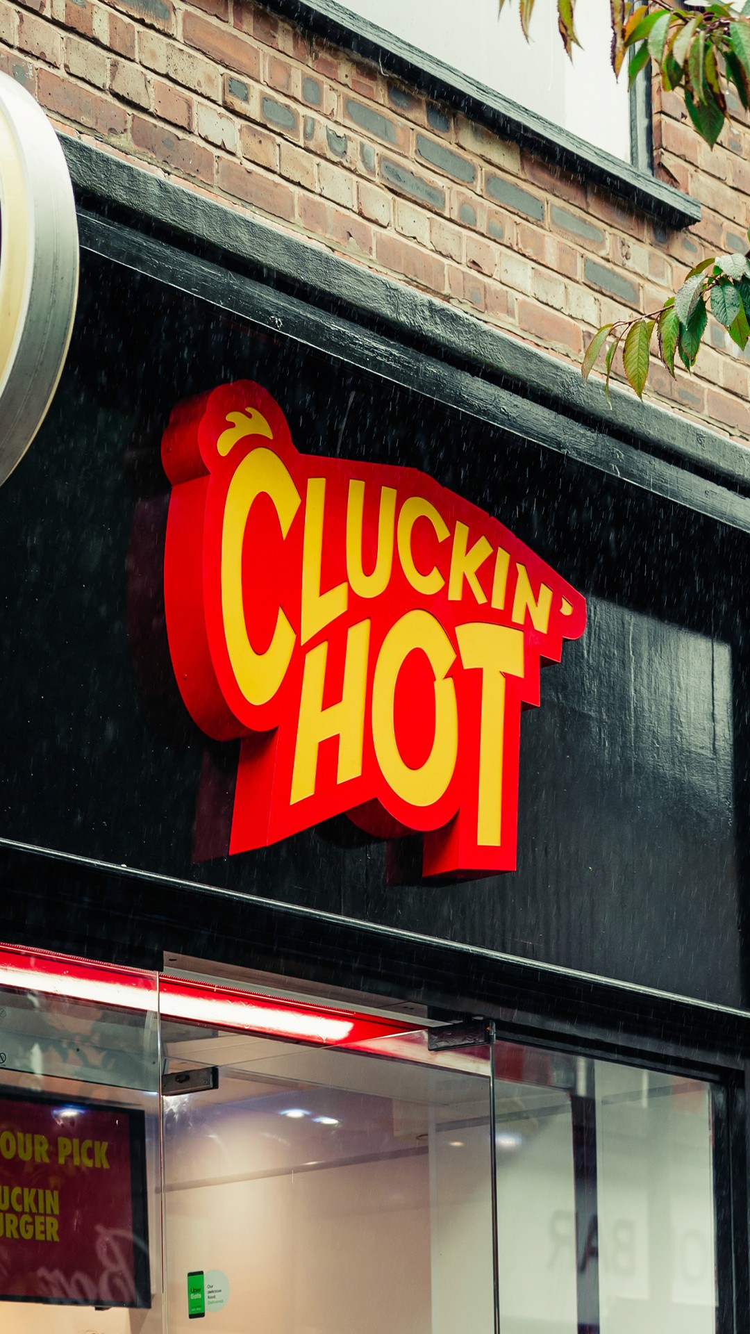
The logo was designed as a bold, character-led mark that captures the brand’s attitude.
The custom wordmark uses strong, slanted letterforms to suggest energy, speed, and heat. A stylised chicken head sits above the “C”, instantly reinforcing the product offering while giving the logo a distinctive silhouette that reads clearly at any scale.
The use of “Cluckin’” in the name was intentionally leaned into throughout the identity, allowing the brand voice and visuals to work together naturally. This language choice reinforces memorability and gives the brand its own tone without feeling forced.
Red and yellow were chosen as the core colour palette to signal heat, flavour, and appetite. The contrast is designed to be loud and attention-grabbing, ensuring strong visibility on signage, menus, posters, and social content.
The identity was extended into a full visual system built for consistency and impact. Menu designs prioritise clarity and hierarchy, making it easy for customers to order quickly while still feeling bold and branded. Posters and outdoor applications use strong typography, short punchy messaging, and high-contrast colour blocks to cut through busy environments.

The result is a distinctive, high-energy brand system that positions Cluckin’ Hot as bold, confident, and instantly recognisable.
From logo to launch, the identity works seamlessly across physical and digital touchpoints, helping the brand stand out in a crowded market and build momentum from day one.
Cluckin’ Hot now has a scalable brand foundation that supports growth, ongoing campaigns, and future expansion, all while staying true to its core promise: flavour, heat, and personality