ADA Aesthetics
ADA Aesthetics is a South London-based aesthetics brand offering clinical treatments with a premium, considered approach.
Year
2025
Industry
Aesthetics
Services
Brand Identity
Client
ADA Aesthetics

ADA Aesthetics is a South London-based aesthetics brand offering clinical treatments with a premium, considered approach.
The project focused on creating an identity that felt credible, elevated, and instantly recognisable across both digital and physical touchpoints.
Before we began, ADA Aesthetics relied on a Canva logo that lacked re nement and consistency. It didn’t reflect the quality of the service, and it wasn’t built as a scalable brand system. The client needed more than a new mark, they needed a visual language that could build trust, position them competitively, and translate cleanly across signage, social content, and printed assets.
Our work delivered a full identity system designed to feel modern and premium, while remaining minimal and confident.

In the aesthetics industry, perception is everything.
ADA Aesthetics needed to look established and trustworthy in a market filled with similar clinics using the same visual cues, templates, and trends. Their previous Canva logo not only felt inexpensive, but it also limited how the brand could show up across different formats, it wasn’t adaptable for signage, social layouts, or marketing assets, and it offered little in the way of a recognisable signature.
The challenge was to create an identity that balanced clinical professionalism with a premium aesthetic, ensuring the brand stood out without becoming overly decorative or relying on short-term trends. The end result needed to work equally well on a treatment-led photographic style, minimalist typography, and real-world applications such as windows, loyalty cards, and print.


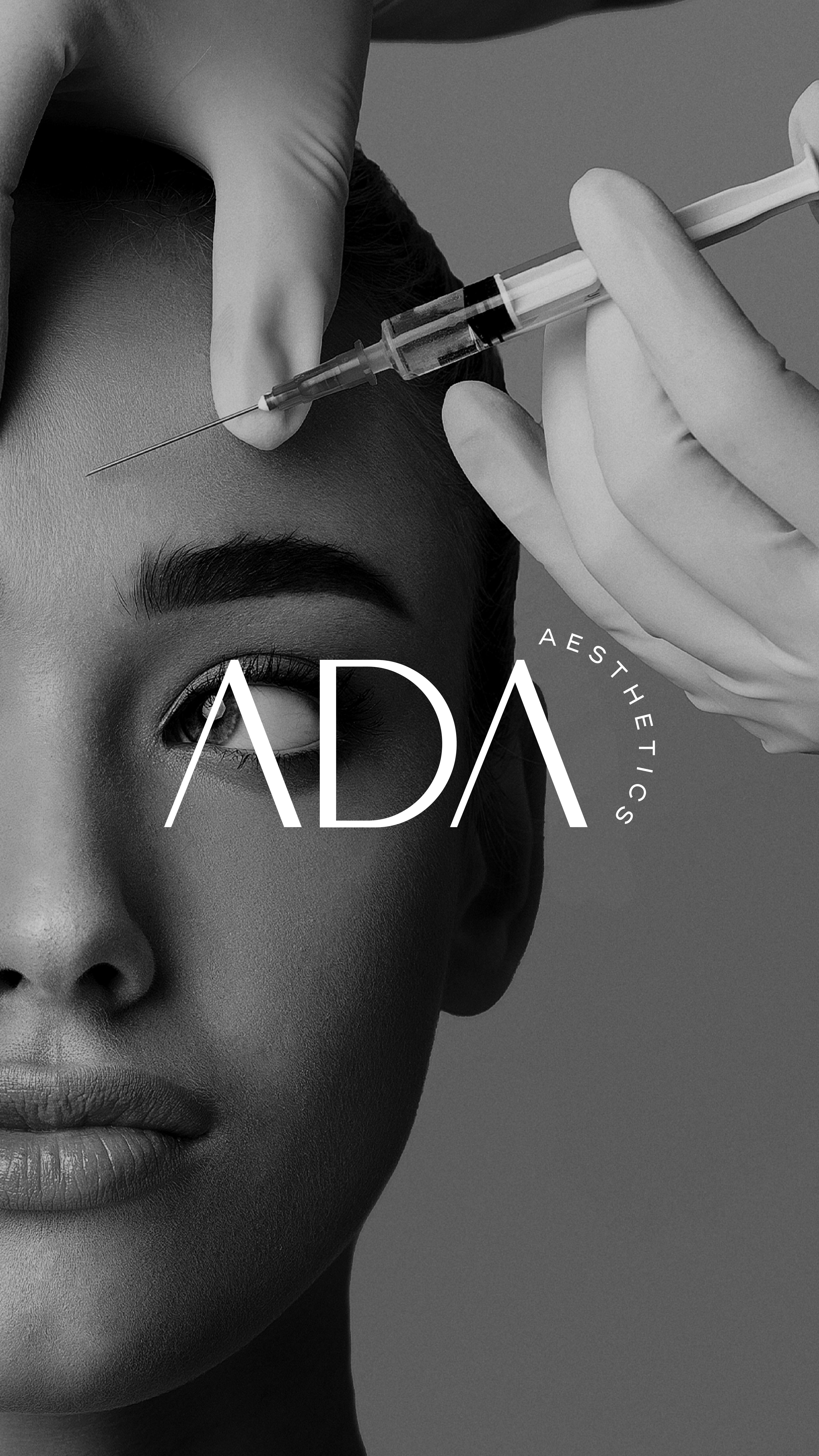
We built the identity around a confident, minimal wordmark: ADA.
The letterforms are clean and elongated, creating an editorial feel that reads as premium, modern, and controlled a tone that aligns with high-trust aesthetic services.
A key feature of the system is the supporting circular type treatment used for AESTHETICS. This detail introduces movement and a distinctive silhouette without adding noise. It also gives the brand a flexible secondary element that can sit comfortably in corners, on social layouts, and on collateral, functioning as a recognisable stamp.
The visual direction leans into high-contrast black and white, which reinforces professionalism and clarity while allowing the photography to carry the emotional weight of the brand. Across the imagery, the identity is designed to sit condfiently over clinical shots and portraits, creating a consistent look that feels high-end, intentional, and immediately ownable.
The identity was developed as a system that could translate across real touchpoints, not just mock-ups. On the storefront and window application, the bold scale and minimalist layout gives strong street presence, making the brand recognisable from a distance and legible at a glance. On social, the typography-led layouts allow ADA Aesthetics to communicate treatments clearly, while maintaining a consistent premium look across posts and stories.
Print assets such as loyalty cards and business cards were designed to carry the same tone: minimal, considered, and brand-led reinforcing trust at every point of contact and helping the clinic present itself consistently in a competitive local market.

The outcome was a clear repositioning for ADA Aesthetics.
What previously looked templated and inconsistent is now a cohesive brand system built for trust, recognition, and longevity. The refreshed identity provides ADA Aesthetics with a more premium presence across South London and beyond, with a scalable design system that supports daily marketing, client retention, and long-term growth.


